Video is increasingly the key media format for business marketing and communications.
However, specific guidelines for ensuring your video content aligns your brand to other media collateral such as print, web and social media platforms is often absent from existing company brand guidelines.
Your business may produce video content with various creatives – your in-house team, a video production company and larger agencies. But without video-specific guidelines, there is a danger your video content with display your brand in an inconsistent way.
This article will provide a good overview and checklist so that your design team can work with your video content team to develop these essential video brand guidelines together.
The brand guideline staples
These are the essentials in any brand guideline document. Kind of like those essential items when cooking (milk, flour, sugar etc), the key elements for your brand are Logo, Font and Brand Colours. While the treatment for these elements will already be included in your brand guidelines, it’s a good idea to reiterate these in the video section – either by highlighting which page these can be found or providing a quick overview at the start of the video guides.
Logo
This should include all the do’s and don’ts for the treatment of your logo. How large should it appear on screen? Can it be overlaid on a moving background visual or different colour? Should the logo be animated? To this last point, developing a logo animation (or multiple variations for video formats) is a key asset. Later in this article, I’ll provide more detail regarding the set up of an online asset library.
Font
Provide an overview of the font/s to use for video content. Perhaps you would have a main font for headline text on screen, then a lighter font for sub-text. It’s important to note that the amount of text you should use on a video screen is very different from printed material. Usually, text is kept to a minimum due to the duration it remains on screen and also the size of the text can be difficult to read if it’s too small. Further on in this article, I’ll provide some examples for different uses of fonts such as lower thirds and bullet points.
Brand Colours
Provide an outline of your primary colours and also secondary colours to use. Be conscious of which colours can be used together – for example, if you have a block of text with a solid background, ensure these colours provide contrast so it can be easily read. Brand colours are also useful for developing other animated graphic elements on screen such as a video border or background elements.
And here’s a reminder – video uses the RGB colour format, not CMYK as print does. So, ensure you provide specific colour palette guidance for RGB.
Tone of voice
Many brand guidelines feature an overview on the tone of your brands voice, to be reflected in copywriting and language. Is your brand tone of voice bold, strong and informative or perhaps friendly, approachable and warm? When it comes to video content, the tone of voice is critical for developing scripts, interview content and even footage captured.
Motion Graphics Templates (MOGRT)
Adding animated brand elements to your videos is essential – lower thirds, full screen graphics, call to action screens etc. By developing a library of MOGRTs, this allows any video producer to download and import specific templates for editing or animation software and then customise as required.
This is a great opportunity for your design team to develop the look and style of these static graphic elements and then work with a motion graphic designer to bring these to life through animation. See below for some great examples on which elements a MOGRT should be developed for, because by having these will ensure there are no inconsistencies or reliance on video producers to extract what they believe is the best graphic treatment from existing static guidelines.
Sequence/timeline and export settings
It’s a good idea to provide a quick snapshot of various edit project settings such as how to set up sequences/timelines – dimensions, frame rate etc. Export settings are also important – ideal file size depending on duration, data rate, file format (mp4, mov etc).
Platform formats and dimensions – Horizontal, vertical, square
With social media platforms offering so many options to view video content, it’s now not a case of one-video-format fits all. Your audience may be viewing on a TV, their desktop or mobile device. So you need to provide specific guidelines on the dimensions for the outputs – often times you may need to provide multiple dimensions for the same video as it could be displayed as standard widescreen on Youtube, square format for LinkedIn and vertical video for Instagram stories. Your guidelines could include a table of information for the various video formats and correct sizes.
Captions
Another important part of video content is accessibility and often brands prefer to have ‘burnt-in’ captions. My suggestion would be to produce two versions of the final videos – with and without captions. For the version without captions, it’s important to provide an SRT file when uploading, which gives the viewer the choice to switch captions on or off. But for the ‘burnt-in’ option, you can get creative in how the captions are displayed to suit your brand. For example, be specific about the font, text size and whether captions are displayed in one, two or three lines. To help text stand out, I suggest using a background – which could be black with 70% opacity or a solid brand colour.
Lower thirds and text call-outs
This is perhaps the most used element of your brand when it comes to video content. A lower third is simply the graphic element for displaying a person’s name and role when they speak on camera. Text call-outs are similar, these more refer to text blocks that may point to certain features within the scene. My best tip is to ensure one of the first animated templates you produce is for Lower thirds and text call-outs
Icons and graphics
Icons and graphic elements are a great inclusion in your brands creative as they can be used to depict your products, services, functionality and other areas of your business. By having an extensive library of these elements will enhance the engagement in your video content. By animating these elements also brings that extra level of interest in your video content. A video producer can have the flexibility to download pre-animated elements or the original projects and then modify these to fit within current edits as required.
Animation elements
I recommend developing a number of transitions to be implemented in your video content – as short as 1 second. You could provide details on how to produce animated videos with your brand in mind. For example, for character animations, what should the style of the characters be, the colours used etc. Or for more of the icon/kinetic text style, how should these elements look?
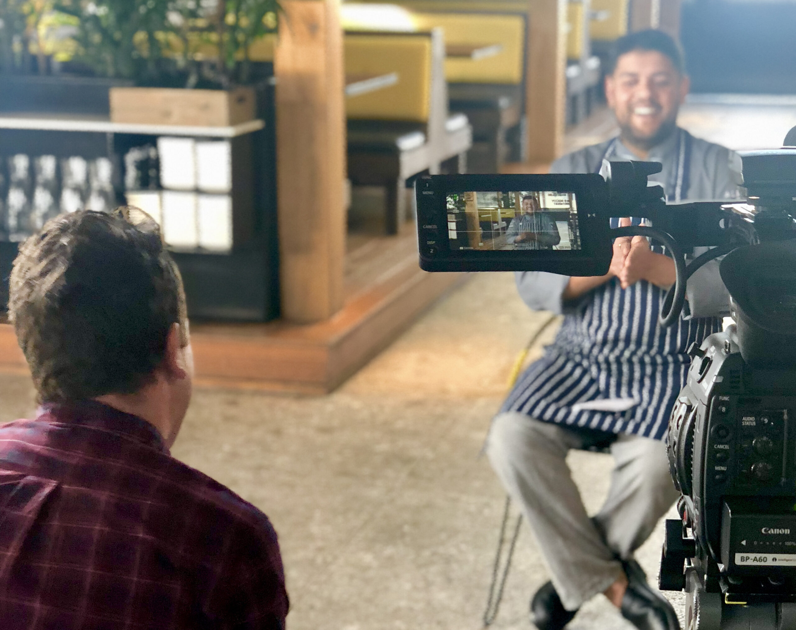
Filming style
It’s a good idea to develop an overview of the preferred filming style of your content – your brand isn’t just about post-production. While every video will have a different purpose, the look and feel of the visuals should be recognisable of your brand and this doesn’t have to be just in your brand colours, logo and fonts. Existing guidelines may include an overview for photography – expand on this to include filming.
Your filming guidelines could include:
- How to shoot interviews – the lighting, 1, 2 or 3 cameras and audio recording.
- Framing – how should you position the subject on screen – tight, mid or wide shots?
- Overlay footage capture – should this be handheld camera, static on a tripod or should every shot have movement of some kind?
- Perhaps you do a lot of studio work with presenters on a white background – provide a full rundown on the setup and kit used.
- Does a shallow depth of field work best for your brand?
It’s important to provide a few online examples here of other videos your business has produced.
Maybe you use stock footage for certain projects – ensure you provide guidance on what type of stock footage to use.
Filming Colour profiles / LUTs (Look Up Table)
Often you will be working with video producers from different sources, potentially using different cameras and kits. I strongly advise that video producers shoot in a Log profile, which to the untrained eye looks like a flat, desaturated visual. But the key to shooting in a Log profile is that there is much more flexibility in colour grading in post-production as more colour information is retained in the original clips – the advantage being that you have a better chance to matching camera clips in the edit. Perhaps even go as far as to produce specific LUTs for different cameras (Canon, Sony, RED) that colour graders can download and apply to raw footage when editing. It’s also important to decide if the colour grading should be bright, vibrant colours or perhaps more desaturated (even as far as black and white).
Music and audio
Your brands tone of voice guidance will help here by ensuring the right style of music is chosen for your video content. You may have a library of music that producers can choose from, or provide details of tempo, genre, mood, instruments etc that video producers should look for when searching through stock music libraries. Do you have a specific audio sting for your logo or sound effects for different graphic elements?
Introduction screens
Often a video will start with an animated title screen, which could show your logo and a headline of the video topic. By developing a template for this will ensure the font and size remains consistent, along with other elements.
Full-screen text
A good example for this is a simple powerpoint slide with bullet point text. Rather than a static image and text, provide suggestions on whether each bullet point can be animated etc.
Call to action/end tag screen
This is the final screen of the video – is there a consistent call to action or should this be adjusted depending on the video content? This could be contact details, further information or simply a website address. I recommend also including your logo. You may wish to also provide credits and special thanks.
Media asset access
Creating an online library of all your brands media assets is essential – with easy access for your internal and external teams. Provide a link (or multiple links) in your guidelines. This way, there are no excuses for your brand being implemented the wrong way in video content. This asset library should be categorised into:
- Fonts
- Logos as static graphic formats (vector, jpg etc)
- Animated logos in various formats (alpha channel/colour background; inverse colour option; horizontal/vertical; duration; HD/4K etc)
- Graphic/text screen templates – Introduction screens; call to actions/end tags; full screen bullet points/slides
- MOGRTs – for lower thirds and text callouts etc
- LUTs for colour grading Log footage and different camera formats
- Projects – are there existing editing/animation projects setup to be used when project starts in post-production?
- Templates for social media video content
- Graphic elements – this could be an extensive library of icon animations, video frames and other animated graphic devices
- Static graphics – a good example for this would be a template for video thumbnails, for video producer to save a video static image, then modify text and graphics in Photoshop.
- Audio – do you have a selection of music to be used, sound effects or audio stings.
So, there you have it – a comprehensive guide to give you plenty of ideas and an action list to start developing with your creative teams to ensure consistency across for your brand’s video content.
Please don’t hesitate to reach out if you have any further questions or need would like to discuss ideas on how to develop those video-specific brand guidelines.